
Elevating NAB’s ATM experience
Bringing NAB’s ATM interface in-house and adapting the design system for cash deposits, withdrawals, and everyday banking.
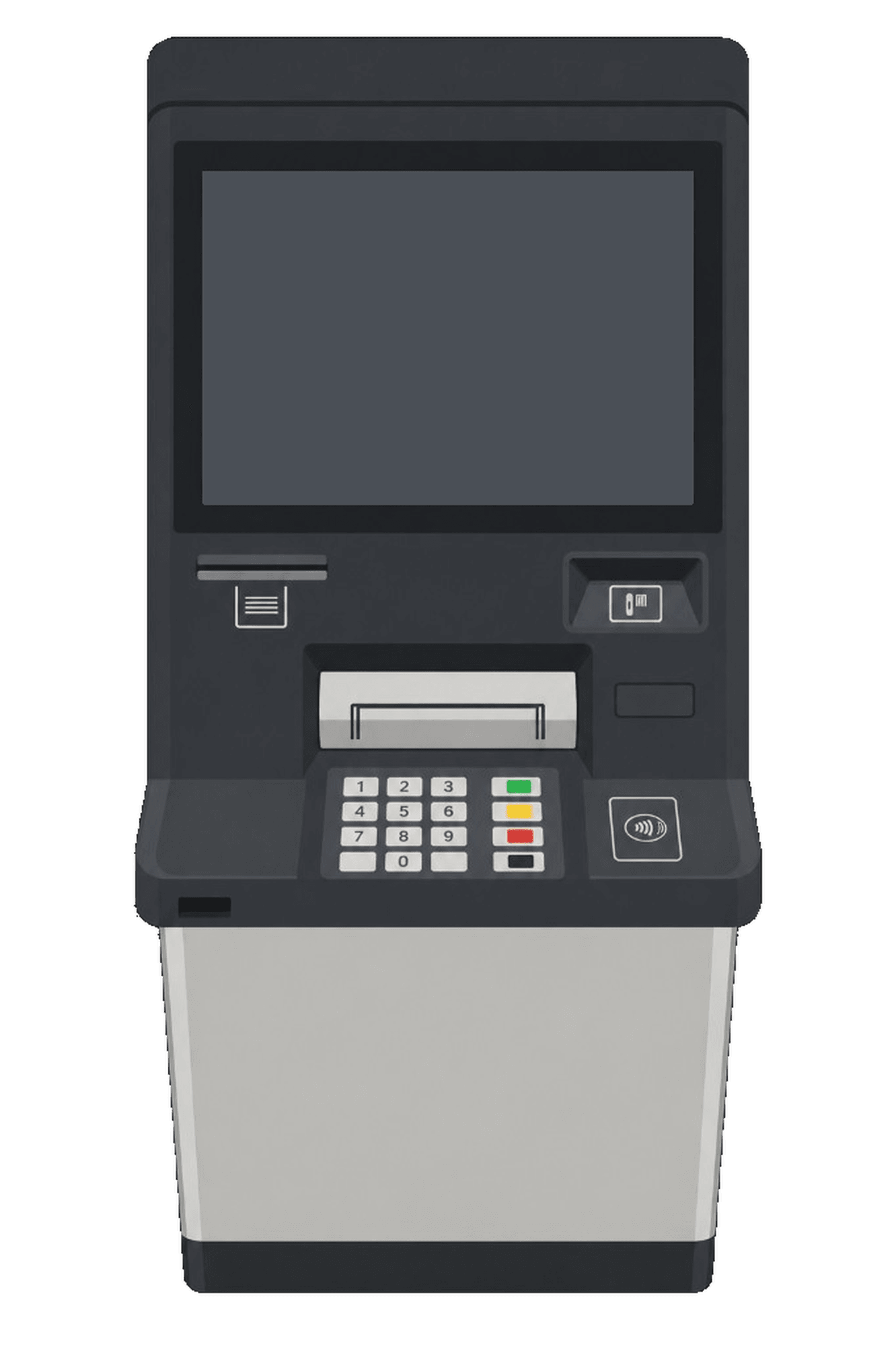
Designing for a physical machine
ATMs don’t work like mobile apps. I tested real machines to see how people move between the screen, keypad, card reader, and cash slot. Display height, physical controls, viewing distance, and lighting shaped every design choice.


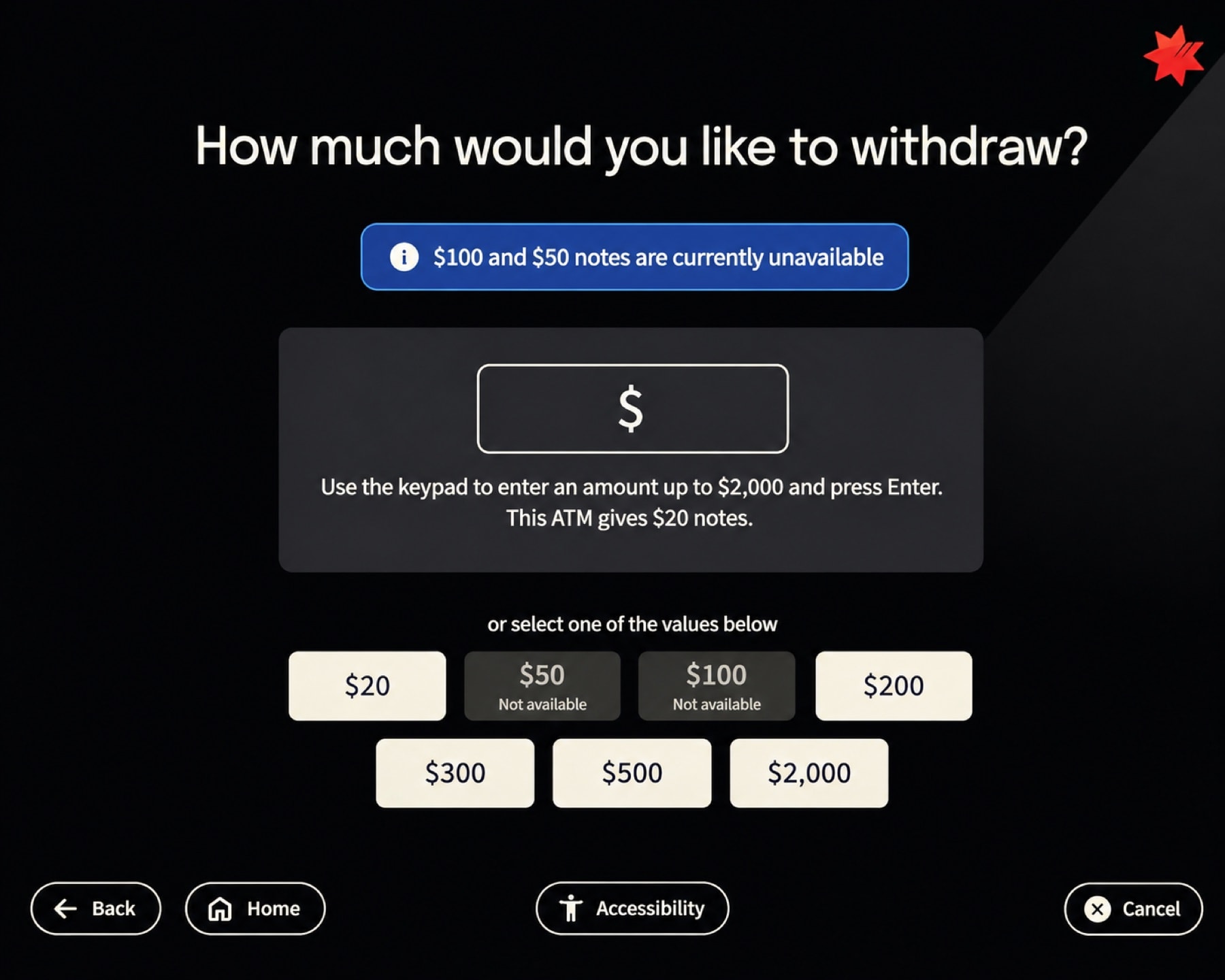
What customer testing changed
We tested 5 core journeys with 12 customers in our Melbourne lab and fixed two key friction points:
Missing memo confirmation
Customers weren’t sure whether their deposit note had been captured. We added a review step so they could confirm it before submitting.
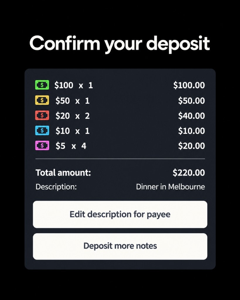
Transfer flow clarity
The existing transfer summary was hard to scan. We separated the source and destination accounts, made the amount more prominent, and added clearer directional cues.
Before
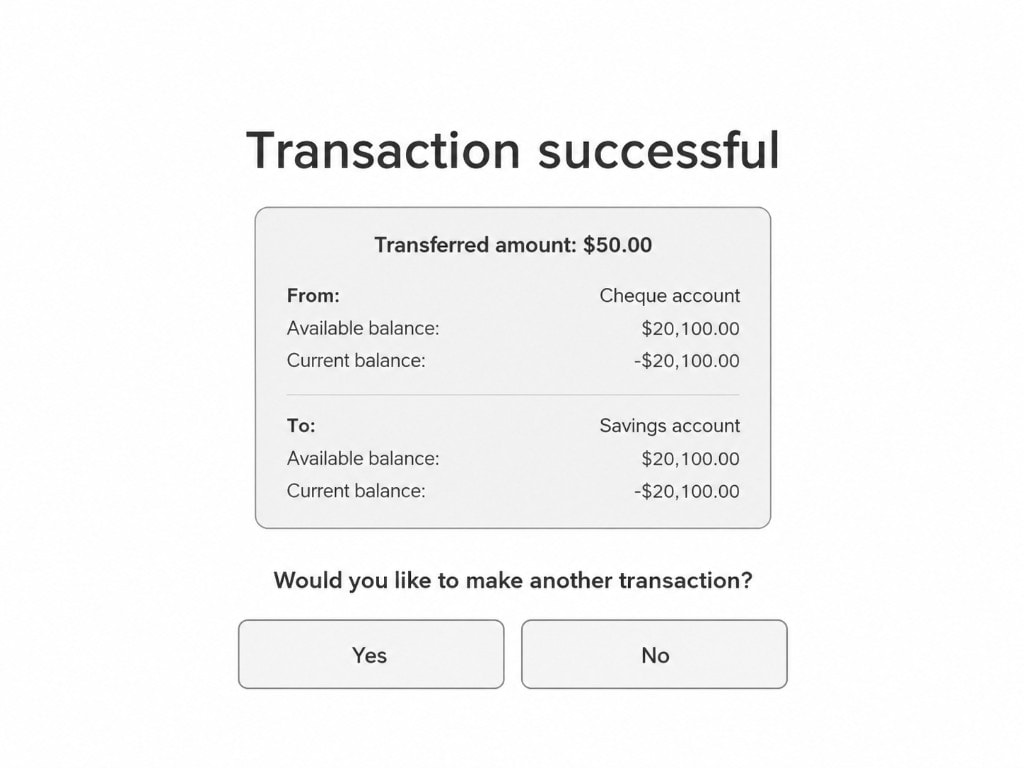
After

Transfer summary, before and after.


Light vs. dark mode on the real machine, showing how dark screens pick up overhead lighting.

Testing on actual hardware
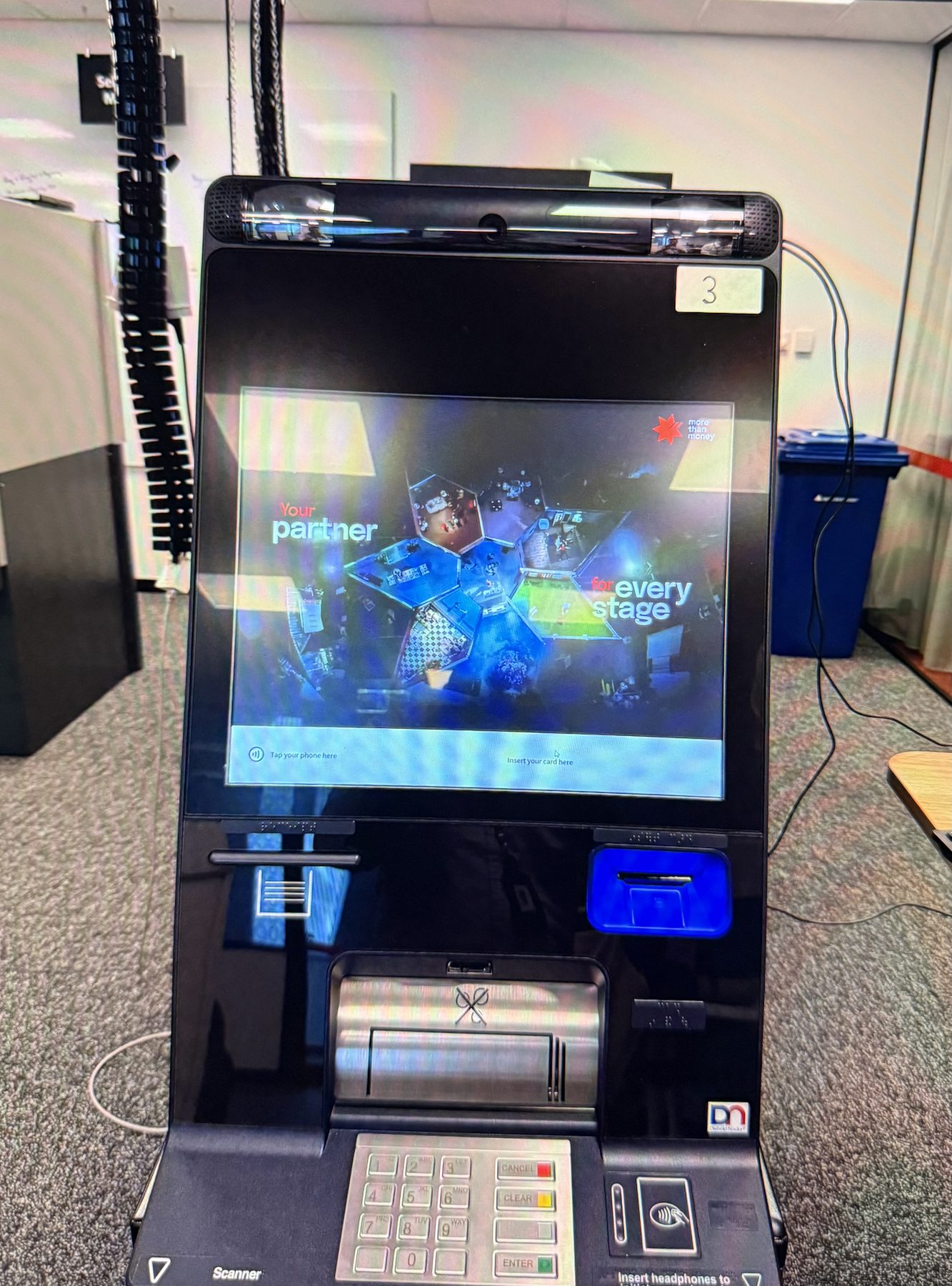
Putting the design on real hardware changed how everything felt. It let us evaluate the full flow, from on-screen prompts to hardware actions, in context.

10
Validating the experience before pilot
Tests across five core journeys with 12 customers validated our interaction patterns and met 100% of our accessibility goals. The work also left a reusable foundation for future ATM features.
5Core journeys tested
12Customers across usability testing
100%Accessibility requirements met across tested flows
11
What I took forward
The biggest lesson was designing for the physical environment, not just a screen. Distance, lighting, reach, and hardware all change how people use the machine. Testing on real hardware early saved us from expensive changes later.