
Helping people pick
the right account
Testing whether a simpler way to compare NAB accounts could help more customers move from browsing into application.
The problem
Too many options at once
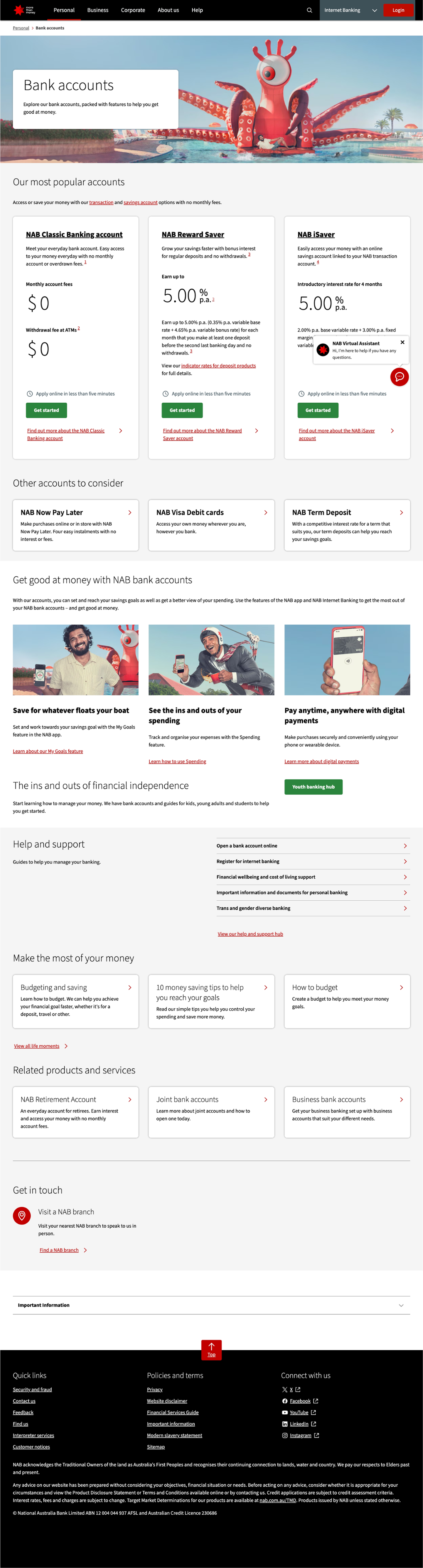
NAB’s existing page presented transaction and savings accounts together, with a lot of information competing for attention. The products were different, but the page gave customers very little help deciding where to start. It also featured a giant red octopus in the hero — something the whole team joked about in meetings, and a useful reminder that the loudest thing on the page wasn’t always the most helpful. We wanted to test a simpler question:
Would customers be more likely to start an application if we reduced the amount they had to consider upfront?
The design
A few focused changes
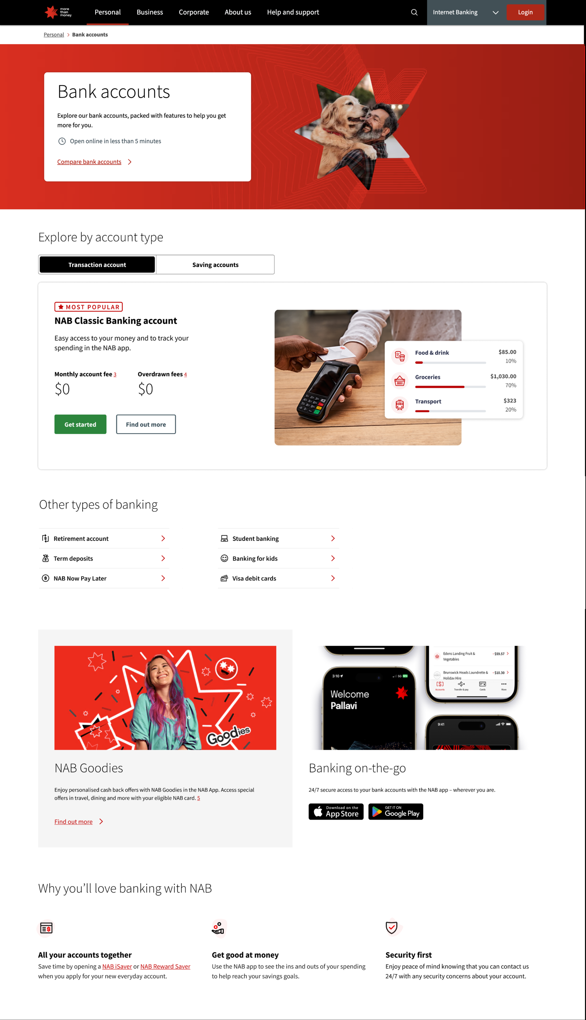
Rather than redesigning everything, we focused the experiment around a few decisions that could make choosing an account feel simpler.
The test
Testing it against the live page
We tested the redesigned page against the existing experience. The variant produced a 9.4% uplift in application starts. That gave us evidence that simplifying the first decision and reducing the amount of information shown upfront could help more customers move into the application journey.
Application starts
Redesigned page outperformed the control in A/B testing.
What I took from it
Experiments don’t need to live forever
The live page has changed again since the experiment, which is something I’ve come to expect from high-traffic sales experiences. Products change. Priorities change. New hypotheses replace old ones. The useful part of an experiment isn’t creating a page that stays untouched forever. It’s learning something about customer behaviour and using that to inform the next decision. That constant opportunity to test, learn and improve is one of the things I enjoy about this kind of work.